I just somewhat recently reprised my QuantifiedSelf talk on testing the effectiveness of a low-carb diet by doing some statistical analysis and visualization of my Dexcom continuous glucose monitor data. The obsessive in me couldn’t help updating my visualizations with the additional six months of data I’ve gathered since I originally gave the talk, so with the R code fresh in my mind, I thought I’d share how I produced the visualizations in my talk.
My Approach to R
I find R quite unintuitive to use. Everything from the direction of the assignment operator1 to the (for me) horrors of trying to manipulate and reshape data in a data.frame bothers me. So my general approach to R is to get my data into the form I need it in before I import it into R. Usually I do this in Python, where the csv package works pretty well for outputting a file that can then be imported into R with read.csv().
Getting Dexcom Data into R
In my iPancreas GitHub repository, the script dexcom_stats.py will generate .csv files for importing into R that need minimal adjustment to produce the visualizations from my QS talk. dexcom_stats.py depends on classes in churn_data.py, and its usage is:
$ python dexcom_stats.py -d /path/to/dexcom/xml/or/tab-delimited/file
The output .csv files will end up in a directory labeled ‘to-R’.
Trend Lines
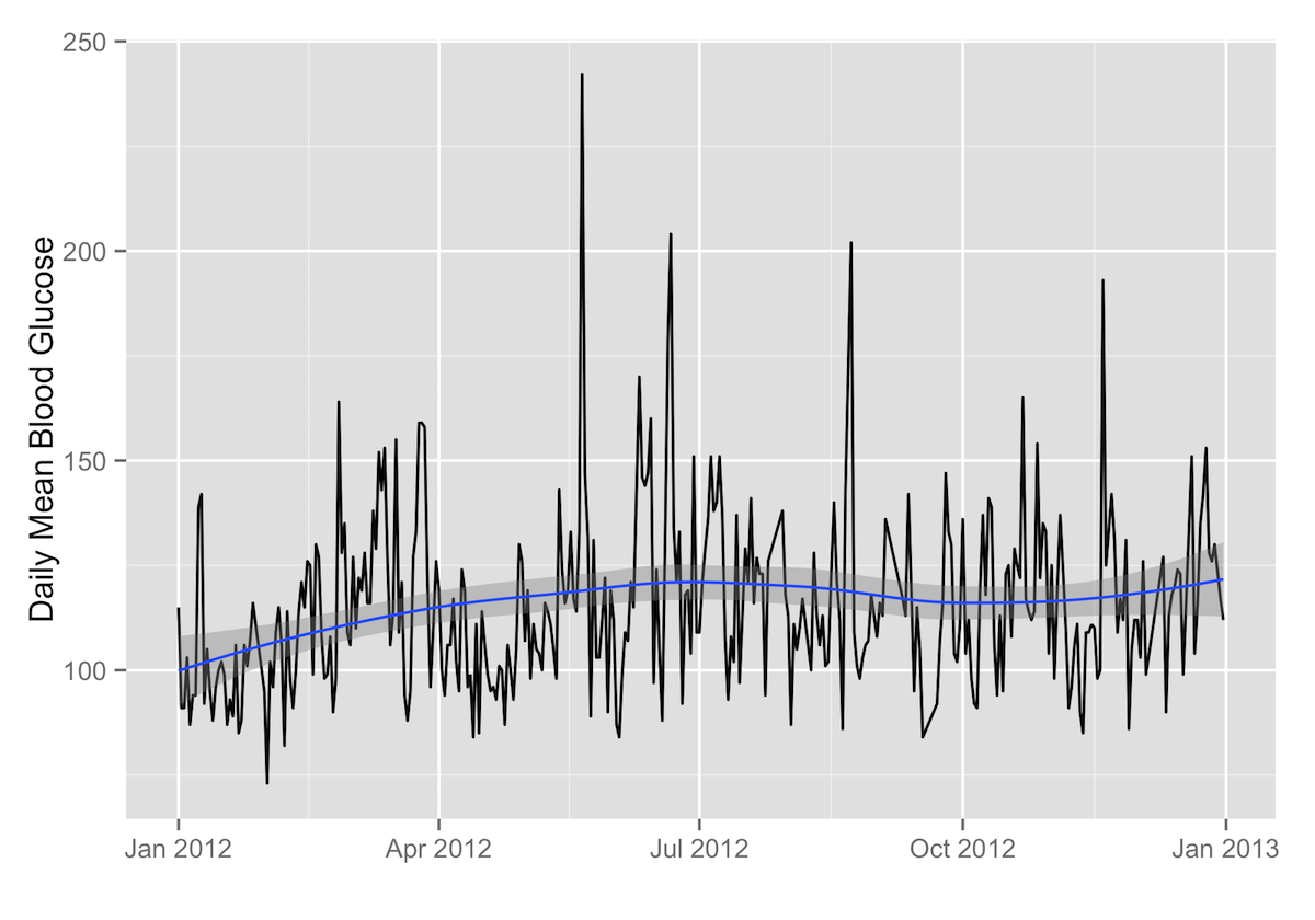
To create a plot of your daily mean, standard deviation, or percentage of hypoglycemic readings with a trend line, all you need is the .csv file in the ‘to-R’ directory ending in _stats.csv and the following R code (assuming you assign the read-in .csv file to the R variable daily.stats):
Daily Mean2
ggplot(data=daily.stats, aes(x=as.Date(date), y=average)) + geom_path() + labs(x="",y="Daily Mean Blood Glucose") + geom_smooth()
Breaking It Down: Trend Lines
Piece-by-piece, what the R code above does is:
-
ggplot(data=daily.stats, aes(x=as.Date(date), y=average))passes the data to ggplot2, with time on the X axis and your daily mean blood glucose on the Y axis. -
+ geom_path()3 tells ggplot2 to plot the daily means with a line. -
+ labs(x="",y="Daily Mean Blood Glucose")just adds the X and Y axis labels (in this case, none for the X axis). -
+ geom_smooth()4 adds the smoothed conditional mean of your daily means with a shaded confidence band.
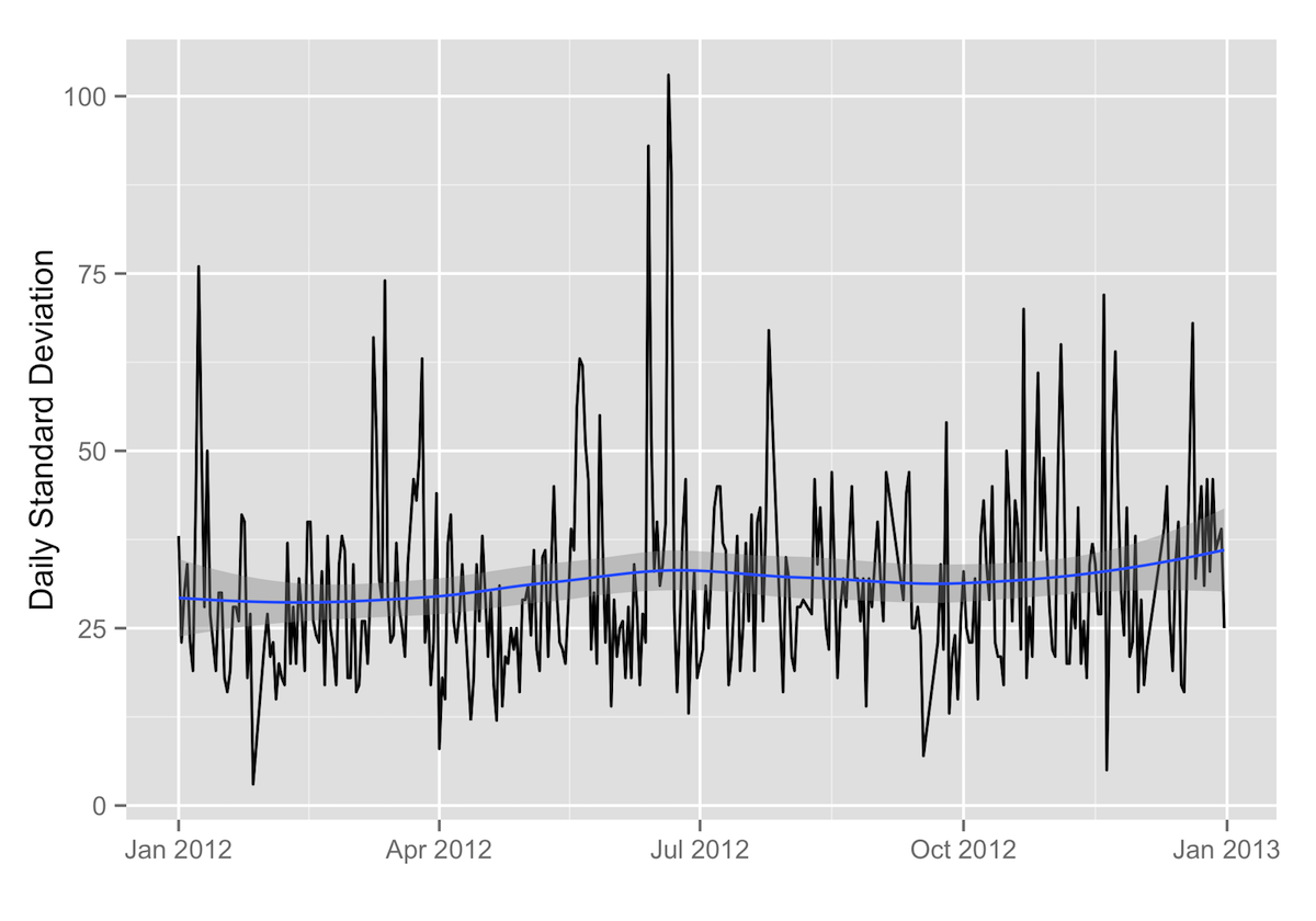
Daily Standard Deviation
ggplot(data=daily.stats, aes(x=as.Date(date), y=standard_deviation)) + geom_path() + labs(x="",y="Daily Standard Deviation") + geom_smooth()
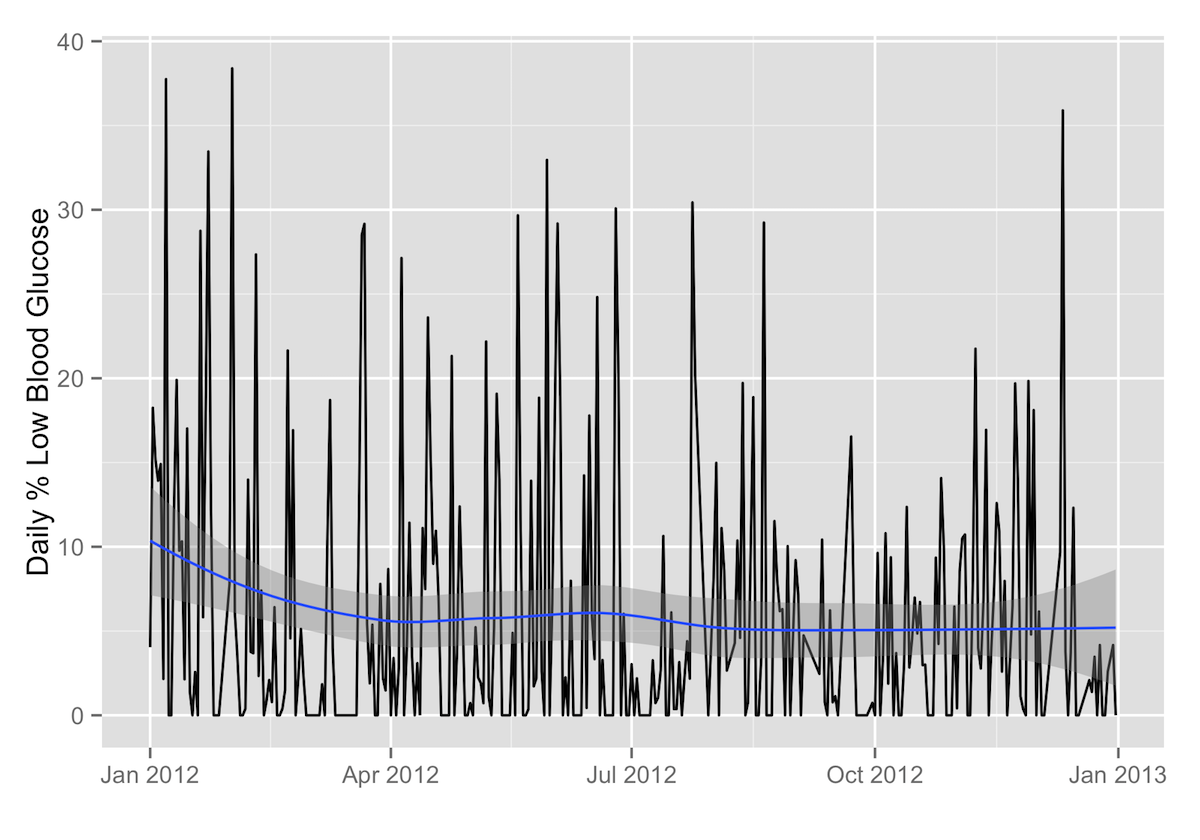
Daily Percentage of Readings under 65 mg/dL
ggplot(data=daily.stats, aes(x=as.Date(date), y=percentage_low)) + geom_path() + labs(x="",y="Daily % Low Blood Glucose") + geom_smooth()
Comparing Samples
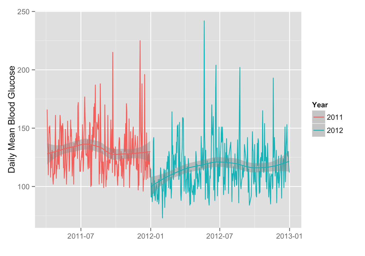
If you want to compare two samples of data, it’s easy to do that as well. For example, to compare two years of daily means, the following R code will produce distinct trend lines for each year of data:
ggplot(data=daily.stats, aes(x=as.Date(date), y=average, group=year, color=year)) + geom_path() + scale_color_discrete(name="Year") + labs(x="",y="Daily Mean Blood Glucose") + geom_smooth(aes(group=year))
Heatmaps
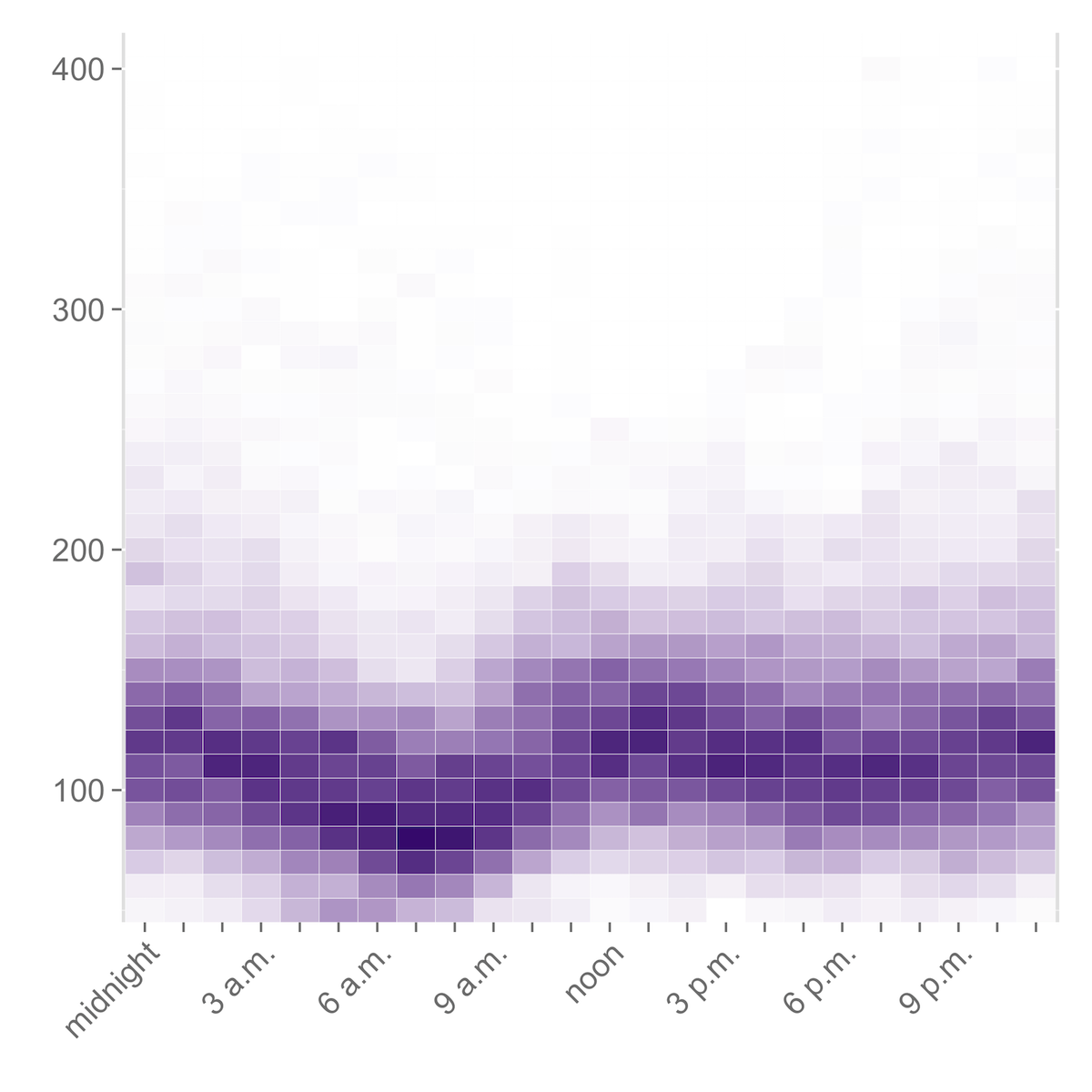
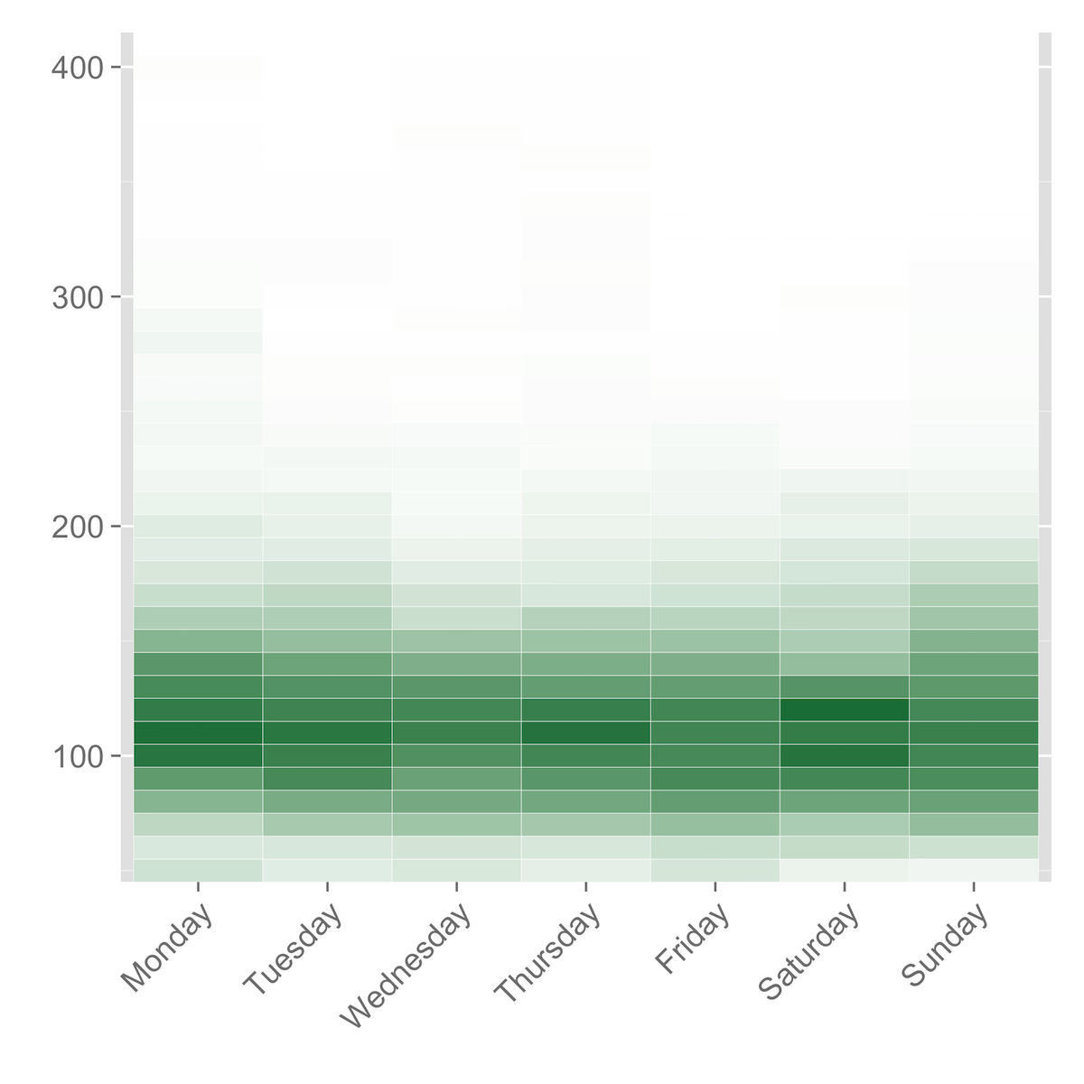
Heatmaps represent the frequency of blood glucose readings within a certain range by means of color: darker shades represent higher frequencies, and lighter shades represent lower frequencies.
Heatmaps by Time of Day
The .csv file ending in _time_heatmap.csv can be used to produce a heatmap that shows the frequency of your blood glucose readings in different ranges by hour of the day. (This visualization is, in my opinion, much more useful for spotting patterns in your blood glucose by time of day than the Dexcom software’s “modal day” chart.)
After importing the .csv ending in _time_heatmap.csv into R as bg.hour, it is necessary to reshape the data with melt()5 a bit before applying the ggplot2 code.
bg.hour.m <- melt(bg.hour, 'X')
Then the code for generating the heatmap is:
ggplot(bg.hour.m, aes(variable, X)) + geom_tile(aes(fill = value), color = "white") + scale_fill_gradient(low = "white", high = "#461b7e") + scale_y_continuous(expand=c(0,0)) + scale_x_discrete(labels=c("midnight", "", "", "3 a.m.", "", "", "6 a.m.", "", "", "9 a.m.", "", "", "noon", "", "", "3 p.m.", "", "", "6 p.m.", "", "", "9 p.m.", "", "")) + theme(legend.position = "none", axis.text.y = element_text(size="14"), axis.text.x = element_text(size="14", angle=45, hjust=1)) + labs(x = "", y = "")
Breaking It Down: Heatmaps
What the R code is doing to generate this heatmap is the following:
-
ggplot(bg.hour.m, aes(variable, X))passes the data inbg.hourto ggplot2 and tells it to use the hours of the day on the X axis (these are in the ‘variable’ column) and the bins of blood glucose values (in the ‘X’ column) on the Y axis. -
+ geom_tile(aes(fill = value), color = "white") + scale_fill_gradient(low = "white", high = "#461b7e")sets up the plot as a grid of tiles, where the value is represented by the color of the tile, with white as 0 and #461b7e (a dark purple) as the maximum. -
+ scale_y_continuous(expand=c(0,0)) + scale_x_discrete(labels=c("midnight", "", "", "3 a.m.", "", "", "6 a.m.", "", "", "9 a.m.", "", "", "noon", "", "", "3 p.m.", "", "", "6 p.m.", "", "", "9 p.m.", "", ""))sets up the scales on the X and Y axes. -
+ theme(legend.position = "none", axis.text.y = element_text(size="14"), axis.text.x = element_text(size="14", angle=45, hjust=1)) + labs(x = "", y = "")removes the legend and angles the X axis labels for easier reading.
Heatmaps by Day of the Week
If you want to look for patterns in how your blood glucose varies according to the day of the week, you can do that with a heatmap as well, using the .csv file ending in _day_heatmap.csv.
The procedure is exactly the same as for the heatmaps by time of day. After reading in the .csv and assigning it to bg.day, you melt the data with bg.day.m <- melt(bg.day, 'X') and then use the following R code:
ggplot(bg.day.m, aes(variable, X)) + geom_tile(aes(fill = value), color = "white") + scale_fill_gradient(low = "white", high = "#1b7d46") + scale_y_continuous(expand=c(0,0)) + theme(legend.position = "none", axis.text.y = element_text(size="14"), axis.text.x = element_text(size="14", angle=45, hjust=1)) + labs(x = "", y = "")
Violin Plots
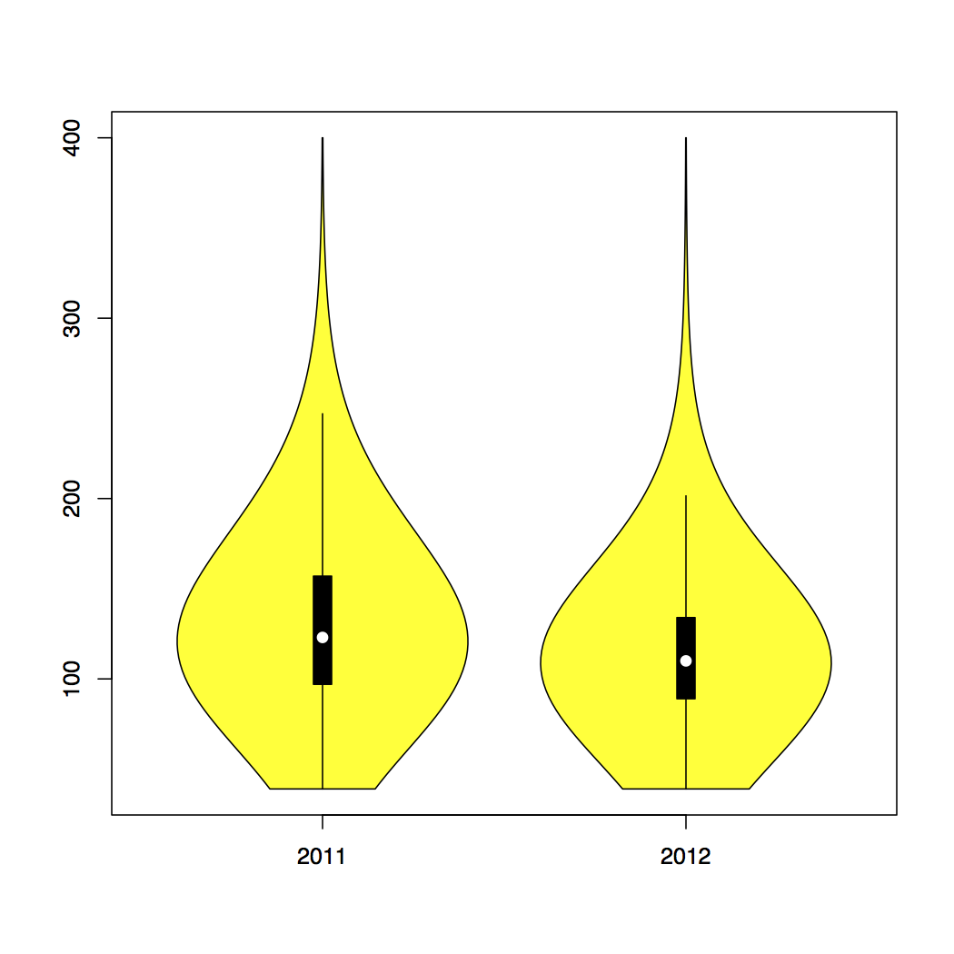
Violin plots are a combination of a boxplot and a kernel density plot. I think they do a particularly good job of showing the basic information about a distribution (i.e., the mean and standard deviation) while also giving a good visual representation of these things, in the height and shape (including the width) of the plot, with the wider parts of the ‘violin’ representing higher frequencies of occurrence, and the narrow parts representing the opposite.
The vioplot package in R makes it quite simple to produce violin plots from blood glucose data.6
vioplot(dd2011$blood_glucose, dd2012$blood_glucose, names=c("2011", "2012"),col="yellow")
This code passes the blood_glucose column of two data.frames (named ‘dd2011’ and ‘dd2012’) to vioplot(), assigning the labels ‘2011’ and ‘2012’, respectively, and coloring the plots in yellow.
-
Honestly, it makes no sense that
str <- "foo"assigns ‘foo’ to the ‘str’ variable. A variable points to its value, not vice versa. /rant ↩ -
If you don’t have ggplot2 installed, you’ll need to install it with
install.packages('ggplot2'). And in any case you’ll need to load it withlibrary(ggplot2). ↩ -
geom_smooth()documentation. The documentation forstat_smooth()provides more information on how ggplot2 effects the smoothing. ↩ -
melt()is part of thereshapepackage, so you’ll need at leastlibrary(reshape)if it’s already installed, otherwiseinstall.packages('reshape'). ↩ -
vioplotisn’t in the standard library, so you’ll need to first install it withinstall.packages('vioplot')and then load it withlibrary(vioplot). ↩