In May 2014, while adventuring in the wilds of The Internet, I came across this article by Thrillist magazine, in which the foodie newsletter commissioned a professional coffee expert (Lorenzo Perkins, an executive council member of the Barista Guild of America and certified coffee instructor at Cuvée Coffee) to do a “cupping” of grocery-store coffees that come in a steel can—your Folgers, Maxwell House, etc. Perkins’ notes from the cupping struck me as absolutely hilarious1, and also, once I thought about it for a few seconds, a nicely small and self-contained dataset that could be great for a small data visualization project.
I started the project before seeing Sarah Groff-Palermo’s talk on ‘artisanal’ data visualization at ForwardJS, but hearing her talk definitely inspired me to keep at it, as I think this small, mostly text dataset fits squarely within the ‘artisanal data’ concept she introduces.
Now, at long last, I’ve got a minimal working visualization, which I estimated would take me a weekend to put together, but of course took me much longer2, and I ended up putting almost the entire kitchen sink into it, in terms of new tools and techniques that I wanted to try. What follows here are my notes about some of these new tools and techniques, as well as other lessons I learned along the way.
Overview: What the visualization does
I should start with a brief description of the features included in the current version of the visualization, so here they are:
Browser compatibility
The visualization was intended to work across all browsers and devices, but for the minimal version, I ended up supporting the following, where I’ve only really tested the most recent major version of each of the browsers listed:
- Chrome
- Firefox (animation of some of the fonts is very poor)
- Safari
- iOS Safari
- iOS Chrome
- Android Chrome (animation performs sluggishly even on a Nexus 5 and one SVG feature had to be disabled)
Internet Explorer, even the latest version, is not supported because it has yet to implement the SVG <foreignObject> element3.
Landscape orientation on small mobile devices is not supported, mostly because I wasn’t up to the task of devising yet another layout for the display of the relevant data.
Accessibility
-
The visualization is fully navigable by keyboard using the Enter, Esc, Tab, Shift+Tab, and/or arrows keys to navigate the interface.
-
Almost all of the text is large, and the contrast between the text color and the background color meets or exceeds the contrast ratio given in the WCAG 2.0 accessibility guidelines for AA-level conformance (in all cases) and AAA-level conformance (in most cases).
-
The visualization does not yet support screen readers, but I plan to try this in a later version. Although an accessible data visualization may sound like an oxymoron, I believe that this particular dataset, due to its textual nature and small size, is ripe for attempting the development of a completely accessible interactive data visualization.
User Interaction: Interfaces
In desktop browsers, the visualization responds to keyboard navigation (this in part for accessibility reasons, as mentioned above) as well as navigation by mouse. On touchscreen browsers, touch navigation replaces mouse and keyboard, and in addition general touch events or gestures replace some buttons because the interface was either too crowded for the buttons at a smaller size, or the buttons proved to be too finicky as touch targets.
Responsive Design
The visualization is responsive to browser window size, interface types (i.e., mouse and keyboard versus touch screen), and screen orientation where relevant. There are four different layouts for the main overview of the data, depending on screen size and orientation.
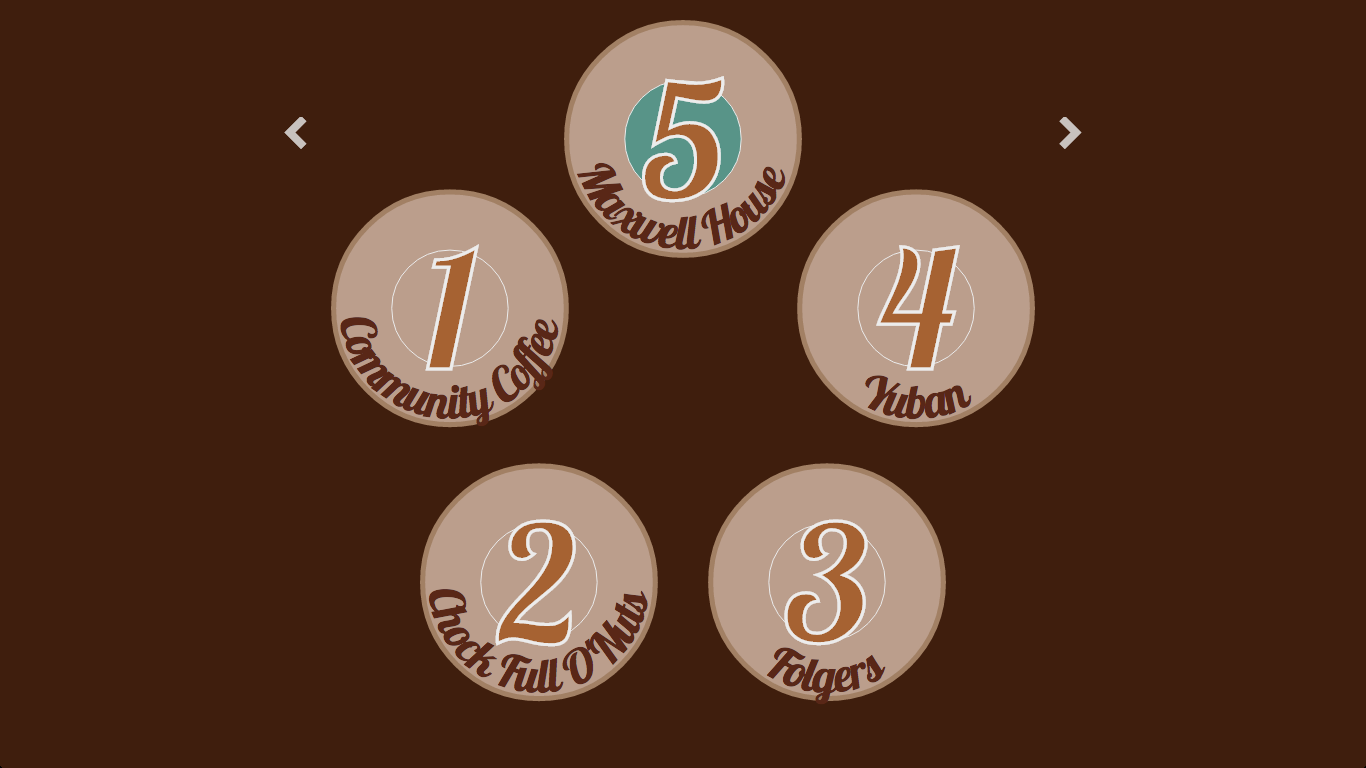
The “default” layout, on screens that are large enough, lays out the five coffees from the tasting in a pentagon shape, with the top point of the pentagon the “focus” position and left and right buttons available for navigation—that is, moving the focus to a new data point.
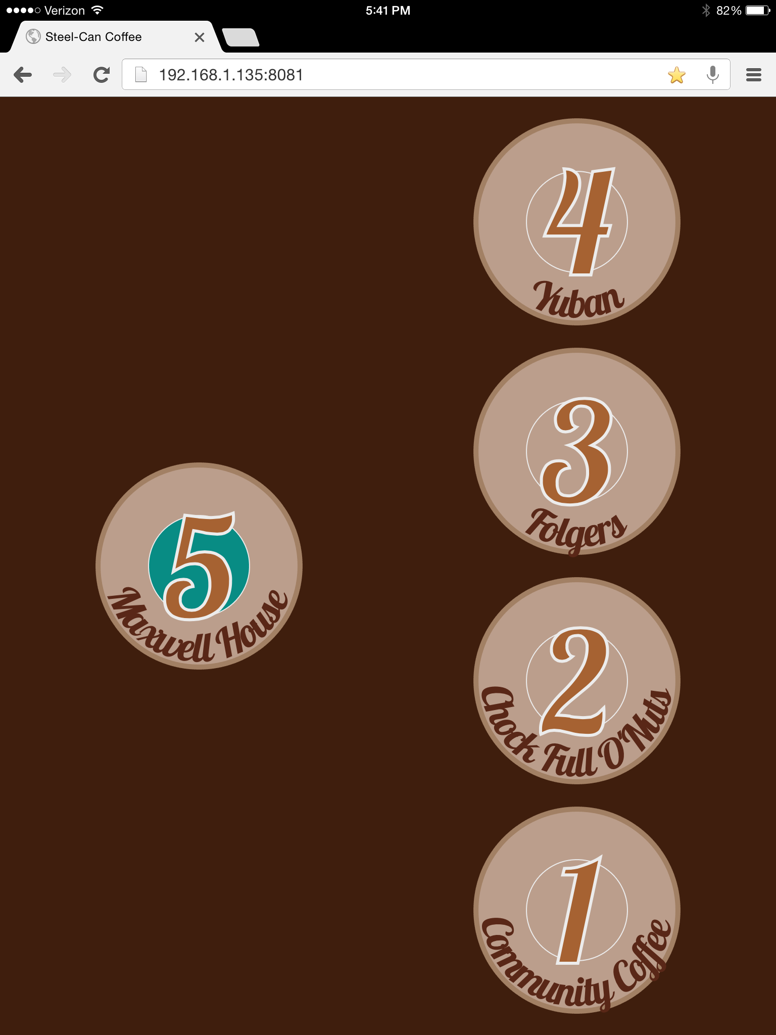
In browser windows with a narrow aspect ratio (or tablets in portrait orientation), there is a “tall” layout with two columns; the data point currently in focus appears alone in the left column.
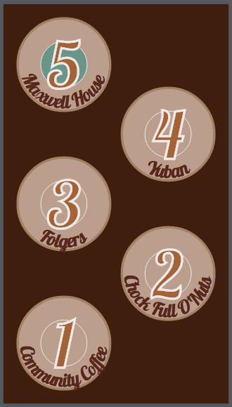
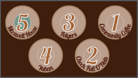
On small screens—most likely mobile phones—there are two additional layouts, one each for portrait and landscape orientation. Focus is always the top left position.
Technical Notes
Tools
D3
D3, the very popular JavaScript data visualization library, is the engine behind turning this very small dataset into an interactive data visualization. In many ways, D3 is underutilized in this project. Because the dataset is small and static, we render all of it immediately, so there is no need for D3’s signature enter/update/exit pattern. Since there are no numeric values in the dataset (aside from the rank of the coffee in the final results of the taste test), there is also no need for any of D3’s other helpful tools such as functions to build numeric scales along which to plot the data and to generate and draw axes to represent such scales.
In fact, after a colleague pointed out that React is also well-suited to creating and manipulating SVG elements, I realized that this particular dataset—because of its miniscule size and lack of numerical values—would be a perfect opportunity to experiment with such an approach to creating an interactive data visualization. If I ever get around to making another version of this visualization, I will likely try removing the D3 dependency and using React instead. A real advantage of the React approach, aside from React’s blazing fast rendering speed, could be the way React itself forces better (and more readable, once you’re familiar with React’s lifecycle methods) code organization.
Lo-Dash
Nothing to see here4, really. Lo-Dash is just an alternative implementation of the functionality provided by Backbone’s Underscore utility library. (If you’re not using Backbone with Underscore already included as a dependency, Lo-Dash is a good alternative because it’s faster than Underscore.)
Fastclick
I can’t say it any better than Fastclick itself says it:
FastClick is a simple, easy-to-use library for eliminating the 300ms delay between a physical tap and the firing of a click event on mobile browsers.
Essentially, Fastclick reduces the “laggy” feeling that otherwise occurs when you load a JavaScript single-page app in a mobile browser (as opposed to a native mobile application). Remaining lag, if present, is due to the difference in processor power on mobile vs. desktop/laptop devices.
It really is easy to use.
Hammer
Hammer5 is a JavaScript library that allows you to add support for multi-touch gestures in a pure HTML + JavaScript web application. I used it to add left and right swipe gestures (for navigation to the previous or next data point, respectively) to the visualization on touch screen devices. The API is simple; I feel the real (design) challenge is making it clear to your users that multi-touch gestures are available, since that’s not common on the average webpage viewed in a mobile browser. This is a problem I don’t believe I’ve solved yet…
Viewport Units Buggyfill
Yeah, this JavaScript package has a sexy name, doesn’t it? For those not in the know, viewport units are a new feature in CSS3. I believe I first came across them via this episode of The Web Ahead. In some ways, viewport units are simply an alternative to percentage-based sizing. Except, y’know, more awesome. I am probably a little too obsessed with them…
…and, as it turns out, they don’t work properly in iOS Safari. The issue is that the viewport units aren’t updated on orientation change in iOS Safari, so while the height of the viewport in iOS Safari when the mobile device is in landscape orientation should equal 320 pixels (which is the width in portrait orientation), instead iOS Safari still reports viewport width units (vw) based on 320 pixels and viewport height units (vh) based on the height in portrait orientation. This JavaScript package fixes that.
Features
Color Palette
I used the mobile app for Adobe Color CC (née Adobe Kuler) to derive the color palette for the visualization from a mug of coffee that I brewed myself. Making color palettes is super fun :)
“Breathing” CSS Animation
The data point currently in “focus” has an animated fade-in, fade-out color in the center circle. The idea here is a subtle (or maybe not-so-subtle?) suggestion of “Touch me!” (or “Click me!”, depending on interface type).

A breathing animation between two states—in this case, two fill colors—is just an infinite loop of a keyframes definition that specifies one of the two states at 0% and the other at 50% (not 100%, because you want one loop of the animation to be a “round trip” from state one to state two then back to state one before the next loop starts). I’ve used linear easing, but the difference between linear and the default ease6 is fairly subtle here.
Curved Text
Given the large amount of variation in the length of the names of the coffee brands tested in the cupping—from ‘Yuban’ to ‘Community Coffee’—I knew it was going to be a challenge to find a way to give an overview of the data that (a) wasn’t boring (e.g., a simple bulleted list) and (b) didn’t give larger emphasis to the coffees with long names over the short ones. One of the only ways I could think to keep all the coffees on an equal footing, visually speaking, but still accomodate shorter and longer names, was curling the text of the coffee brand name inside a circle representing each brand.
Getting curved text exactly right in SVG was a bit of a fun challenge; I won’t go through all of the details in this post, but instead refer the curious reader to a bl.ock where I put together a minimal example along with an explanation.
<foreignObject> and Flexbox
For the details view for each datum, I chose to use HTML within SVG by using an SVG <foreignObject> element with HTML inside.
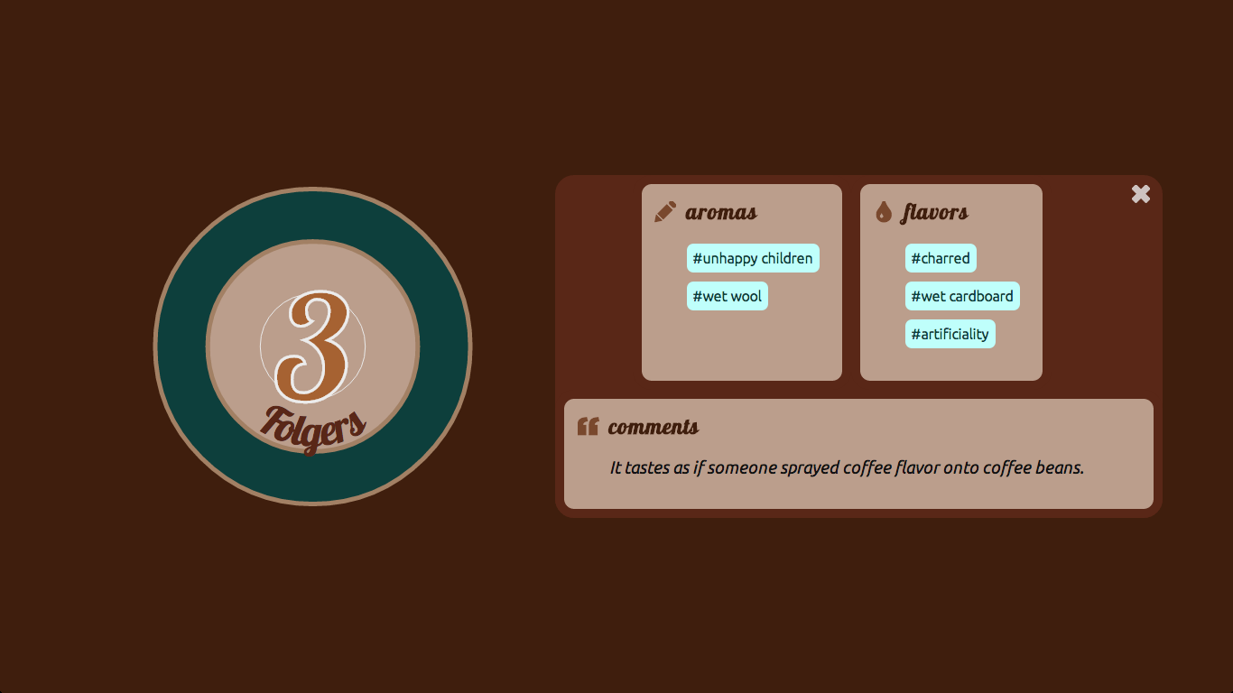
I chose to do this because laying out text and information is what HTML is good at; it’s rather painful to lay out a lot of text (especially multi-line text) in SVG.

Unfortunately (and embarrassingly7), it wasn’t until I was testing the nearly-finished visualization that I found out that Internet Explorer has not yet implemented SVG <foreignObject>. At all. Zip. Zero. Zilch. Nada. If or when I get around to making a 2.0 version of this visualization, I will definitely be getting rid of the <foreignObject> use; I might, for example, be able to use an HTML container with position: fixed; to achieve similar results.
Within the HTML container inside the <foreignObject> element, I laid out the sub-sections of content using CSS3’s new flexbox layout, which is my new favorite thing8.
Responsive SVG
One of the early inspirations behind this project was a conversation with Vivian Brown about techniques for making SVG responsive in a D3 visualization. Hat tip to her for pointing me to this Stack Overflow discussion. The top-voted answer in that discussion lays out a solution for making an SVG responsive that does not require redrawing the image with every resize event. Instead, by leveraging SVG’s viewBox and preserveAspectRatio attributes, the image is simply rescaled on every resize event (essentially drawn as if the SVG still had the dimensions it had originally).
At first, I thought I would employ the viewBox approach in this visualization, but two things changed my mind. First, this visualization is simple; there are only five datums and a relatively small number of SVG elements to be drawn in any of the layouts. Drawing (or redrawing) is cheap. Really cheap. Second, this visualization employs a fair number of <path> and similar elements (e.g., strokes providing borders for shapes), and these elements can get very distorted under the rescaling approach, depending on the original size of the viewport and the difference between original and post-resize dimensions. In the end, therefore, I decided to simply redraw everything on resize; it performs smoothly, and there’s zero risk of unexpected results after resizing the browser window.
Port-Mortem
There are quite a few things I plan to change or do differently if or when I get around to making a new version of this visualization. To wit:
-
Design truly ‘mobile first.’ (The fact that the default layout is the layout for laptops and desktops makes this version the opposite of ‘mobile first’… )
-
Reconsider the “path” a user is expected to take through the data. Is it annoying to navigate back to the overview between each drill-down details view of a datum?
-
Aim for 100% compatibility with modern browsers. Test along the way in order to achieve this.
-
Try using React instead of D3, and reduce the number of elements that are rendered using SVG. The dataset for this visualization is almost entirely text, and in many ways the combination of D3 and SVG is overpowered and ill-suited for constructing an interactive interface for the data.
-
Incorporate some stock photos to illustrate some of the aromas and flavors. Some of them are so visual—‘unhappy children’, ‘wet dog’—they’re just begging for this!.
Fin.
-
My favorite by far is one of his aroma notes for Folgers: “unhappy children.” ↩
-
In fact, according to my git commit history, it took about four months to put together, although the work was by no means continuous. ↩
-
Apologies. I will jump on pretty much any excuse to link to TV Tropes. Consider yourself warned. ↩
-
Yes, it derives its name from exactly where you’d guess the name comes from. ↩
-
Smashing Magazine has a great article on CSS3 easing, including the math! ↩
-
Because I should have been testing from the beginning, at the very least checking for compatibility when adding major features. ↩
-
I might even declare that I like flexbox more than viewport units, and that’s saying something. ↩